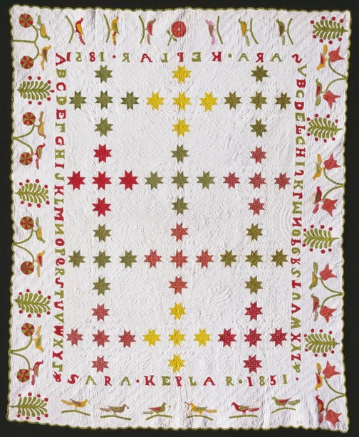
Vintage quilt, 1851
Detail of Sara Keplar's quilt
Vintage sunflower blocks set with stars in the sashing, about
1840-1880
The green often seen in mid-to late-19th century quilts is a grassy green, the product of two natural dyes in blue and yellow that are laid one over the other.
Sara Keplar's quilt dated 1851.
Collection of Colonial Williamsburg
See the catalog entry on the Keplar quilt here:
Elizabeth Crandell's 1852 green has held up well. Notice
the subtle shifts from yellow-green to blue-green in the swag,
indicating an overdyed green.
Vintage quilt
Shifts from yellow-green to blue-green are often not so subtle.
The lighter, yellow-green above is perhaps due to a spill on the vintage applique shown at a
Western Washington Quilt Study session. Or ...
Vintage quilt
...the shift may also be from light damage.
Was the quilt folded on that line and placed
near a window?
One of my quilts shown in Clues in the Calico.
The basket looks tie-dyed but the green is
damaged from laundering.
In the mid-19th-century quilt above the shift is from green to blue, again possible laundry damage.
Vintage quilt
Reproductions
Matching that old, over-dyed green plain fabric is difficult. (Green prints are easier---we'll discuss them later.) One aspect of the natural green dyes that adds to their beauty is the depth of color you get when two dyes are applied. It's just not done now.
Reproduction quilt by
Joy Swartz for the American Quilt Study Group's
Quilt Study in Red and Green, 2010
Joy did a great job of finding the right green.
When choosing a green to match the overdyed look you
have to consider whether you want to do the original grassy color,
or the lime green, the color shift visible today.
Moda offers two Bella Solids:
Bella Solids Pistachio (lighter) and Leaf
Sherri McConnell used both in this pieced block.
And then you have to decide whether you are looking to get that depth of color. An approximation of the over-dyed look is in the perfect batik or hand-dye.
You might have to fussy cut around the figures
but batiks can give you that blue/green---yellow/green combination
similar to the old natural greens.
Reproduction star by Becky Brown.
She found a swirly green print with the right range.
Another option is to use the wovens called shot cottons,
which are one shade of warp and another of weft.
The crossed yarns give you a sense of depth.
The darker shot cotton is Pepper Cory's Tea Green
and the lighter is Kaffe Fassett's Chartreuse.
Pistachio in Moda's CrossWeaves is scheduled for 2015 delivery.
Sue Garman's Potted Tulips
The major factor is matching the color, something Sue Garman is good at.
The wrong green just looks wrong.
It's never Kelly green as in these recent appliques.
Setting idea for your stack of star blocks:
Gang the stars into a nine patch like Sara Keplar did. See her 1851 quilt
at the top of the page.
Alternate plain squares cut 6-1/2" with your 6"
star blocks. Then alternate those 18" blocks with plain blocks
cut 18-1/2".
Barb Vedder did this chain of stars a few years ago. She set her nine-patch blocks on the straight. Sara Keplar set hers on a diagonal. Either way the quilt grows fast. It could cover Rhode Island if you can't stop making stars.
One More Thing about Overdyed Greens
These greens of over-dyed blue and yellow are a good clue to a mid-19th century quilt. They were quite popular with quiltmakers but you rarely find them in clothing. About 1880 a change occurred in green colors because of a change in dye chemistry. The vibrancy of the over-dyed, natural greens was replaced by a flatter, duller green. We'll return to these greens from synthetic dyes later in the year.
An end-of-the-19th-century applique with a synthetically-dyed green
fading to khaki.
http://barbarabrackman.blogspot.com/2010/10/faded-greens.html
http://barbarabrackman.blogspot.com/2010/01/poison-green.html
http://barbarabrackman.blogspot.com/2009/08/piece-and-plenty.html


.JPG)


12 comments:
Very interesting information. Green is my favorite color. This quilt- along is really educational as well as fun :)
Light can really do damage to colors, as I have often seen when cleaning things that have been sitting in a sunny room, you can see large areas of faded color.
Love the old green in the last piece, would love to see fabrics with the faded look.
Debbie
The shot cottons are a great idea for depth. This color is certainly harder to find in the repro world.
After reading your convincing post indicating that overdyed greens have more depth of color, I'm tempted to buy some solid green fabric and try using a yellow procion dye to overdye it and see what happens. If it comes out OK, it would just be luck, but why not try?
I'm thinking of trying some dyeing also. First I'll rummage through the stash and see if any likely prospects emerge.
I have plenty of green prints but not a solid of this type of green. I'll hold on to my prints for another entry. Still catching up on previous weeks.
what a surprise to see my reproduction quilt today. I wish I could say it was finished.
I love seeing all the simple stars around blog land.
I've been tempted to jump in - maybe I will!
Send pictures of your dyeing projects.
That would seem to work.
I am the caretaker of our family's quilt which was made by my great-great grandmother, Lucinda Ann Durham Freeman, in 1850, with these overdyed green solids. Pictures of this quilt are on my blog at http://travel4wineblog.com/.
Here is a thumbnail photo of the quilt by Lucinda Dunham Freeman.
Having fun with my "stars". I don't have a smart phone (I know, I know) so I can't figure out how to do Instagram, but they are posted on my blog. Loved seeing you in Quiltmania! Wished the article had been a bit longer. It is still my favorite mag. Thanks for sharing!
Hi Barbara, I have a question related an earlier blog from October 10, 2010. I am trying to match a blue green as featured in the example of the single process synthetic dye blue green used for the background/ back of the large star quilt. I am reproducing a quilt from 1883, & the green has faded to the dun colour you describe. The only example of it I have is left in the binding, & then it also is quite faded, but does seem to have blue in it. I have a sample of willow green, but I think it is too green. The closest I can find online is the kona everglade or emerald, but it is hard to tell . Any suggestions? Many thanks, Fiona
Post a Comment