Wednesday, October 7, 2015

Stars in a Time Warp 39: Claret Red

Reproduction star by Becky Brown


Reproduction star by Bettina Havig in a claret red ground print
with a horsey conversation shirting.


Collection: Jan at WhataLoadofScrap
Vintage stars. 
Claret reds with white shirtings, an early 20th century classic.

Repro block by Evelyne
Claret red is a shade of wine red. We might call it burgundy.

Vintage star from about 1900. Claret reds also were paired with
indigos--- navies and cadet blues.

The claret prints were usually monochromes, white figures on red ground (as were the
blues and blacks.) The color seems to have come from a new synthetic dye.  I'd guess the spare look was influenced by economics: One color on white was cheaper to print, but the minimalism might have been a new, fresh look after late-Victorian fashions.

Louise's star quilt from the same time.
The wine-colored red was part of a new color
scheme in the 1890s.

Louise found this terrific example of a turnof-the-20th-century quilt at a thrift shop.

Style tip from about 1905: Red goes with red.

Quilt date-inscribed 1897
Turkey red star blocks in wine red sashing.

Quilts in this color palette seem so "countrified" to us, but in 1900
this was the pinnacle of cotton quilt fashion.

Quilt date-inscribed 1892
If you want to capture that look you need
to have a stash of reds shading towards what
we called cranberry in the 1970s.

Reproductions

Repro block by Bettina Havig

During the 1990s I copied a charm quilt in the 1890s  palette.
I hand pieced those squares over several years.
The hardest part was finding the right shades. Navy
prints were rare for several years.
Cranberry reds got hard to find.

But this is a good year for wine-reds.

Barb Eikmeier has a few
in her Vintage Shirtings and Dress Prints

A couple of Barb's claret reds in Becky's reproduction block.

The smaller, darker dot is Moda Essential Dots


Jan Patek's new Hawthorne Ridge features a dark wine colorway.


Pam Buda has a few monochromes in Treenware and Berries


And so does Judie Rothermel in Scarlet Evening

What to Do With Your Stack of Stars?
Frame Them


Becky's been making a frame for each as she goes.

She put it together during Hurricane Joaquin this week
alternating dark and light frames.

The plan
More pictures of the finished top later.

Another idea: frame it twice with dark and light frames.
This set was on Etsy once.

I saw this set for Blackbird Designs new fabric line Country Orchard when I was at Prairie Point Quilts in Shawnee, Kansas, a few weeks ago. The pattern is Terry Atkinson's Lucky Stars


One More Thing About Claret


Claret is an old name for a wine red color or maroon, but this particular shade of cotton seems to have arrived about 1890.
An 1898 dye manual calls Claret red prints:
"An important style in calico-printing and much in demand..."
and gives a new formula for a brighter though not so colorfast red.

Quilt top date-inscribed 1904

Most of these claret reds seem quite colorfast a century later, however.

Block from a set date-inscribed 1903


Saturday, October 3, 2015

Patchwork Papers for Civil War Re-enactors


Silk mosaic quilt inscribed with initials 
EB and 1866 in the center hexagon

On my Material Culture blog I answered a question about accurate hand-sewing project for Mel and Annette, Civil War re-enactors. In that post I suggested hexagon mosaics of cotton prints, similar to Mary Anne Healy's 1861 quilt at the Smithsonian Institution. 

Detail of a cotton quilt date-inscribed 1861,
Mary Anne Jefferson Healy  1847-1928.
Collection of the Smithsonian
Mary Anne might have begun this as a 14-year-old in 1861.

See more here: http://www.americanart.si.edu/collections/search/artwork/?id=73757

The other question that Mel and Annette had concerned period-accurate papers to baste the cotton hexagons over.
"For the paper piecing, would it be appropriate to cut (reproduction) Harper's Weeklies or some other such type publication?"
That seems reasonable, although I wouldn't want to use flimsy newsprint, which might be hard to baste over and prone to yellow. If the reproduction paper looked substantial enough that's a good idea.

Other options:

I looked at my files of hexagon backs and came up with some ideas and examples.

Cotton over hand-written and printed paper
About 1840

The backing depends on the time period.On the back of mid-century hexagons in Britain and America...

About 1830
We often see cotton prints over recycled hand-written household paper.

The paper might have come from  ledger books, spelling exercises and letters. 

Mixed wool fabrics over handwritten paper
About 1850

Silk? over handwritten paper
Note the fabric patches have been cut as squares so there
is excess fabric on the back.

You don't want to cut up old manuscript letters but you could find some images on the web, print them out on good quality paper and cut those up.

I found "Manuscript Maryland 1861" in a web search

"Handwritten ledger" 1848

You can click on these manuscript pictures here, save them to a JPG or word file 8-1/2 x 11" and print them.

Cotton prints over hand written sheet music
About 1830

Hand copied sheet music was a common household item.

Cotton prints over handwritten paper
and printed paper
About 1850

Silk over handwriting exercises

Cotton prints over a printed paper, a periodical,
a tract or chapbook,
About 1840

Cotton over printed paper of different qualities
Mid-19th-century

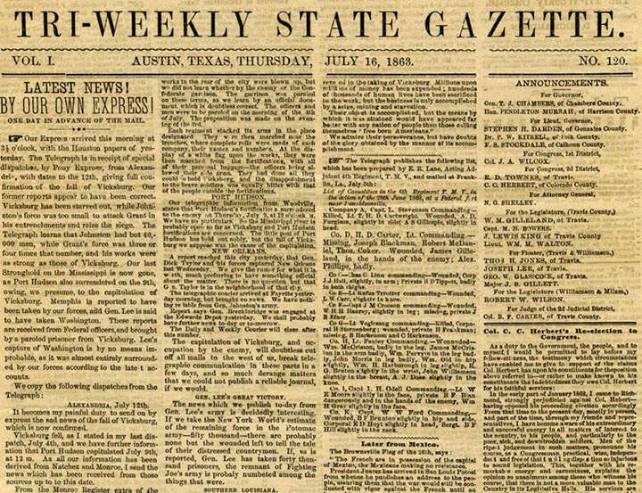
Harper's Weekly would definitely work.

Searched for 
"Front Page Gettysburg 1863"

I would not use actual newsprint. It's too hard to work with.
Print these JPGs on a good quality high rag paper.

Silk over printed paper

You also see hexagons pieced over cardstock but that might be too thick. When you take the papers out the seams aren't tight enough.

Silk and/or wool over cardstock

Silk over colored lithography
About 1880
And color printing would be too late into the 19th century

See more about period backs in this English post.
https://twegblog.wordpress.com/2013/05/15/touching-the-past-neredah-mccarthy/

I'm thinking. What if you created an 8-1/2" x 11" JPG of handwriting; then laid a transparent layer of hexagon templates on top and printed that out? Sort of like Carrie's annual expenditures below.