Wednesday, September 16, 2015

Stars in a Time Warp 36: Lancaster blue and Greek Keys

A double blue print star in Becky Brown's reproduction block.

Vintage quilt top about 1870-1890

Blue with a touch of violet was popular about the same time as the bronze-shaded browns we've been discussing for the past few weeks.

Blue basket weave in a Centennial quilt from about 1876

We call this print style Lancaster blue today because we see
so much of it in vintage Lancaster County, Pennsylvania, quilts.

Pennsylvanians loved to mix it with primary colors.

Lancaster County quilters thought it the perfect background
for piecing and applique.

Pennsylvania star from the Flack collection,
end of the 19th century.

It's a variation on a shirting print---lines and small figures
printed in a rather electric blue-violet.
Like the double pink below, there's often white showing through
one or two shades of blue---a double blue?

Star from the Nickols collection at the Mingei Museum.
Notice the lace print at bottom. We'll talk about those next week.

Polka dot blue in a block dated 1875

Swatch dated 1896 from the New York Public Library Collection

Vintage quilt, last quarter of the 19th century.
The shade of blue is an excellent clue to a date of about
1870-1900 (and even later in eastern Pennsylvania)

The color was popular at the same time as Greek key patterns in cotton.


Roman mosaic border
The design is a variation of a classical meander pattern,
found in borders from antiquity.

The Greek key was a fashionable trim
during the 1860s,


...Taste that lingered
into the 1870s and '80s in cotton prints.

1870s?

1870s

The American Museum of Textile History owns
this apron of a centennial print (1876) with a Greek key border.


Rather like this pre-printed apron from 1878 sold
at a Crocker Farms auction.

I didn't realize pre-printed aprons went back that far.

Perhaps the rage for log cabin patchwork and Greek keys
were related.


Greek key stripes are also a good clue to a quilt from about 1870-1900,
often found with the Lancaster blue at the top left.


Reproductions

Repro block in blue with a touch of violet by Bettina Havig

Here's a repro quilt that Lori at Humble Quilts
made from her late friend Jill's stash.

Judie Rothermel's done several collections of Lancaster.

This week you should be looking for:
  •  Lancaster blues
  • Or Greek key meanders in any color.
I'd check the furnishings fabrics if you can't find
any Greek key-style in the quilt fabrics department.

What to Do With Your Stack of Stars?
An Innovative Meander

This complicated set is a variation of the traditional sash plus cornerstone set.

Add a sash finishing to 1-1/2" to one side of
all of your blocks. It's the same thing you'd
do if you were going to set these 6" blocks
with a 1-1/2" sash and cornerstone.
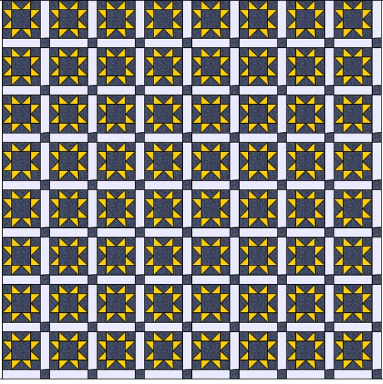
Like this.
Once you add this to every block
(light sash, red cornerstone)
You have a 7-1/2" square.

But rotate the blocks as you put them on your design wall.
Let the sash meander across the quilt.

One More Thing About Lancaster Blue

I have some guesses about the dyes and terms used for this color.The dyers and printers certainly didn't call it Lancaster blue.

Crookes's 1874 dye manual shows this swatch of "Ultramarine."

Note faded spot

I wonder if it's not a new shade from the old reliable mineral dye Prussian Blue.
(Well--- not that reliable, it does fade to white with alkalai laundry soap.)

Here we are at week 36---I have posts planned up to week 47, which will be early December. I bet we  could cover Cleveland with all the stars we've made.

Saturday, September 12, 2015

Two Redwork Quilts at the Pasadena History Museum

Collection of Dr. Carol Morton

Detail of a redwork quilt featuring symbols of the 
Grand Army of the Republic
veteran's organization

The exhibit at the Pasadena History Museum When Johnny Came Marching West: How the Civil War Shaped Pasadena features four Civil-War-related quilts. Two are post-war redwork quilts
honoring the veterans in the G.A.R.


The show closes September 20, 2015.
http://pasadenahistory.org/all-exhibits/johnny-came-marching-west-civil-war-shaped-pasadena/

Some of the symbols are corps badges.

Others like the tea cup are more difficult to interpret.
Not much is known about this quilt's origins.

The other redwork quilt has much to tell us.

Block from the John F. Godfrey Post of the
G.A.R. in Pasadena, California

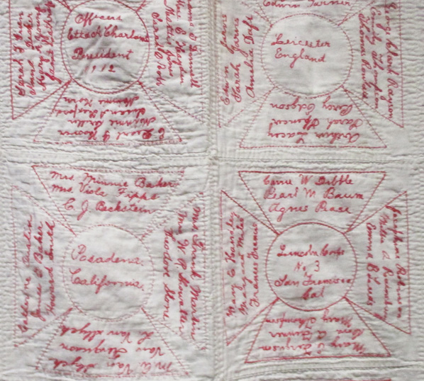
The block at the top left honors a Pasadena GAR president in 1912
Next to it a block from Leicester, England

The entire quilt is covered with names in the form of the cross that is the
symbol of the Woman's Relief Corps (W.R.C), the
ladies' auxiliary of the Union veteran's group.


Redwork W.R.C. quilt
Courtesy of Linn and Jean Hoadley

Collection of Dr. Carol Morton
The quilt is shown with a W.R.C. badge from a G.A.R. 46th National Encampment in Los Angeles, 1912
Train excursion from San Francisco
to Los Angeles

I'm guessing the quilt is connected to that five-day National Reunion in September, 1912, perhaps made by the Thimble Club of the John F. Godfrey Chapter as a fund-raiser and raffle quilt.

I found a little more about the Thimble Club of Pasadena, including photos of members about 1930. This may be another Thimble Club, but the W.R.C. Thimble Club continued into the 1960s.

Thimble Club at Redondo

On a bus trip to Balboa.
They got around.

Read a post about the WRC quilt here:
http://pasadenahistory.org/curators-blog/wrc/


Wednesday, September 9, 2015

Stars in a Time Warp 35: Cretonne

Becky Brown reproduction star,
with a bronzey/cretonne look and large scale figures.

"The Popular New Cretonnes"
Woman's World in the twenties.
The border shows children's prints and florals.

Star quilt with cretonne alternate blocks and border,
About 1880
Los Angeles County Museum of Art

Woman with cretonne drape about 1880

Cretonnes, like earlier chintzes, were designed as furnishing fabrics,not really meant for clothing.

After the Civil War, as America went crazy for calico. Small-scale dress prints manufactured by American mills dominated women's at-home clothing and their quilts. Large-scale prints, the European chintzes that had been so popular in quilts made before the war, came to be "chintzy" in their eyes.

Charm quilt about 1880

Charm quilts were one result of the Calico Craze.
They may include a few large-scale furnishing prints
but the point here was collecting small-scale prints.

A similar quilt about 1910
with a cretonne on the reverse.


In 1861 the Ohio Cultivator warned women against two things:
1) Patchwork
2) And "old fashioned 'curtain calico' with its monstrous figures and glaring combination of colors."

An old-fashioned chintz quilt

Do NOT try this at home!

A new fashioned cretonne top about 1890. 
You couldn't get any less elegant than this, according
to the fashion arbiters.

You can see how "chintzy" began to imply something cheap and unfashionable. 

By the 1870s manufacturers avoided the word chintz and used the word cretonne. Cretonnes were the "proper thing for draperies, hangings, furniture covering, etc." according to the Sears catalog in the 1890s.

Cover of the Ladies Home Journal in 1921.
Chintz was back for decorating

What's the difference between a chintz and a cretonne? Time. Like the words reticule and handbag,
or petticoat and slip.
Comforter about 1900

The red and pink ground cretonnes here have a texture. 
They are twills with a diagonal raised surface rather
than plain weave.

American cretonnes were usually printed with synthetic dyes, sometimes on textured goods such as twills or crepes, so one way to tell a late-nineteenth-century cretonne from an earlier chintz is by texture. Early chintzes were rarely printed on a twill or a cotton sateen. Later cretonnes are often coarser or sleazier fabric. 

Cretonnes can be beautifully drawn and printed.
This one is French, printed in the late 19th-century bronze shades.

Another characteristic of later cretonnes is better registration. Improved technology permitted printers to precisely align figures. Greens were a single step process with no overlap of blue and yellow as in the old overprinted foliage. Backgrounds fit the figures without the overlap and outlines found in early chintzes.
New dyes allowed a wide range of color in cretonnes but many dyes were quite fugitive, particularly blues not derived from traditional indigo or Prussian blue.

Did the cretonne on the right bordering the triangle quilt fade?
Or was it always so shadowy?

Original document print for a cretonne repro
in my Arnold's Attic line of several years ago

Lots of olive and lots of pink in a bronze-style colorway.
That new brown style made these large-scale prints novel.

This one imitates a woven tapestry.

Many shades of blue were available

Cretonnes were popular for the back of an all-calico quilt or comforter. 
They were sometimes described as robe prints.

Black was newly available to printers so for the first time we see black-ground 
furnishing fabrics.

Reproductions

Carol Gilham Jones
Arnold's Attic
The red colorway of the leaf print above.

Becky Brown, Ladies Album.
Pink was a background possibility in the bronze style prints.

Another of Becky's blocks with a grayed blue figure
on medium brown ground.
Cretonnes are made to fussy-cut.

My Ladies' Album collection had an exotic Jacobean floral cretonne.

We at Moda explore these beautifully drawn late 19th-century cretonnes quite a bit. As I mentioned last week, Edyta Sitar has interpeted many bronze-style prints in small and large scale.

Heart's Content
Edyta Sitar for Laundry Basket Quilts

Edyta Sitar for Laundry Basket Quilts

A blue cretonne-style print from my Alice's Scrapbag

And a pink one from my upcoming collection
Old Cambridge Pike

Two by Nancy Gere
Look for romantic, well registered, naturalistic florals.
Here's your chance to use blacks in a repro quilt.

Celeste from Moda
The blue really captures the period color...
And it will not fade like the old cretonnes.

Vin du Jour by Three Sisters.
Romance.

What To Do With Your Stack of Stars?
Copy the Quilt at the Top of the Page

The quilt from the LACMA collection at the top of the page has inspired several 
of today's quiltmakers.

Judy Severson---the unmitered stripe is
an important part of the look here.

Barb at  Fun with Barb

Barb has done it at least twice.

Jerrye Van Leer

One More Thing About Cretonne

Vintage quilt.
Not elegant. Chintzy as a matter of fact.

If an American word has cheap connotations you can always Frenchify it. (Do you French readers know we do that in America?) We pronounce the names of inexpensive stores as if they were French.

Zhay See Pennay for JC Penney
Tar-zhay for Target

When fabric manufacturers needed a new name for furnishing scale fabrics they came up with Cretonne, derived from Creton, a French town that had specialized in manufacturing a coarse cloth made from hemp. Cretonne (pronounced kree-tawn' by women who remember when it was popular) was synonymous with the word "chintz" between 1870 and 1950.

Pardon! as we try to say in French.