
Reproduction star in double pink prints
by Becky Brown

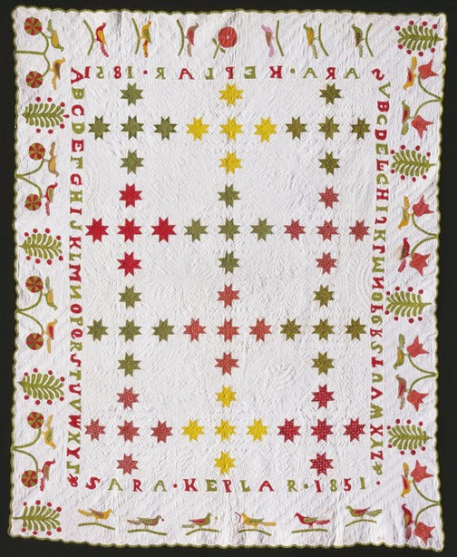
Block from a quilt dated 1837-1838
from the collection of the Concord Museum in Massachusetts.

Vintage quilt about 1870-1900 by Alwilda Stevens Hurd from
the Massachusetts project. Picture from the Quilt Index.

Double pinks in tops from my collection.
Pink printed cottons were popular throughout 19th century.

Vintage child's dress from Augusta Auctions

Vintage quilt about 1870-1900

Vintage quilt about 1840-1900

Vintage quilt about 1840-1900
Dyers often referred to the pink prints as Double Pink
because two shades of madder red were printed on a white ground.

I found an ad for Double Pink Prints (5 c. a yard) in a
1911 issue of a Hendersonville, North Carolina newspaper
called The French Broad Hustler. (Meanings change over time!)
The image is from the Library of Congress's excellent site Chronicling America.

You can see the white background in the center of the star flowers,
one pink is the background, the second pink is the figures.
%2Bpg%2B292.jpg)
Technical writer Jean-Francois Persoz showed this swatch in his 1846 book on dyeing and printing,
labeling it Rose Double in French [Double Pink]. The printed plaid is two shades of pink with none
of the white showing through, making for a bright print.

Reproduction star by Bettina Havig

Vintage block 1836
Lydia Maria Child's star crib quilt looks like a single pink.
The more white ground that shows, the paler the pink.

Paler pinks
One observation is that earlier pinks (before 1860)
tended to be paler than later pinks (after 1880)
but that's an observation. No data.

Reproduction: Hartfield---When I did this
Jane Austen line years ago I wanted
a pale double pink to reflect early 19th-century taste.

Reproduction: It's easy to see the two pinks in this reproduction:
Moda's Collection for a Cause Legacy

Reproduction: Becky Brown used a pink from Terry Thompson's
Merchant's Wife to offset the Prussian blue fabrics from the same line.

Reproduction star by me atop vintage stars
I love this double pink print in the center block but it's too pale to match
the blocks I was intending to copy.

Reproduction star by me
The lighter pinks are easy to find. The more vivid shades are scarcer. You should probably buy a yard when you see one that looks accurate. If your shop carries quite a few buy 3 or 4 fat quarters instead. The look is often scrappy rather than one print carried throughout the quilt.

Vintage quilt about 1880-1910
Pale or vivid, the pinks were printed with the same chemistry and process:
Two shades of red on white.
(Why pale red is always called pink in English
is a linguistic mystery to me.)
Oenw~~60_57.jpg)
Vintage quilt about 1880-1900
The less white remaining in the final print, the more vivid the color.

Today people call that bright pink by many names. Cinnamon Pink is one.

Quilt dated 1905

Pinks were popular for setting squares

Fabric mills continued producing vivid pinks into the 20th century. Pennsylvanians were loyal customers. The Little Jane Chintz above, what I'd call a calico, doesn't seem too colorfast, having
bled into the label.

Vintage top about 1900
Pennsylvania Germans used double pinks without a neutral.
Or maybe pink was their neutral?
Reproductions

Inspiration vintage block (top left) and reproduction by me.

The 2 pink repros on the bottom are by Judie Rothermel,
the top Collections for a Cause: Legacy.
Look for two shades of pink with or without
some white showing through.

Collections for a Cause: Community
should be in shops soon.

Floral Gatherings has accurate double pinks and chrome yellows.

Reproduction quilt by Betsy Chutchian, who
does a great job of interpreting this end-of-the-century aesthetic.
A very pink quilt.

Barb Garrett has captured the Pennsylvania German style in her
small reproduction star quilt.

Rerpoduction by Nancy Near Philadelphia.
Scrappy pinks and browns.

If the true double pink is too much---remember you don't have to go vivid.

More subtle pinks work too.

A few of my pinks from Moda and one of Mark Dunn's.
We often add a little brown to offer toned-down pinks.

Solid pinks won't do for 19th-century copies,although these Bella Solids would make good interpretations.
You just don't see many pink solids until the 1930s. My guess is they weren't colorfast and everybody knew it. Double pink prints gave you the same effect with much more durability.
\

Reproduction star by Bettina Havig
Read more about Double pinks in pages 33-35 of my book Making History: Quilts and Fabric from 1890-1970.
What to do with your stack of stars?
Use them in a border.
Piece them together side-by-side for a 6" finished border in a medallion-style quilt.

Enduring Love by Carol Hopkins
Frame an applique or pieced center or a printed panel.

Pride and Glory by Annemarie S. Yohnk

Bobbi Finley, Jane Austen panel

Eva Severance

Bettina Havig, Wedgewood
One More Thing About Double Pink
One reason double pinks were so popular in quilts is that they were the staple fabric in girl's dresses. In 1871, Luna Warner at 15 was considered young enough for pink prints. Her mother brought home "four kinds of pink calico" for her dresses.

Read more about Double Pink in my book Making History: Quilts & Fabric from 1890-1970, pages 33-35.


.JPG)


